Pleasant Hill Library
Rebrand
Pleasant Hill library is a branch of the Austin public libraries and similarly to many of the smaller branches does not have a unique cohesive identity. Recently renovated after being closed for a period the space was given new life so it deserves a brand identity that reflects that. Through spending time at the branch I found that most of the people who regularly visited were children and their parents. Pleasant Hill is a reliable neighborhood library offering enriching activities at no cost.
Visual Identity
Wordmark
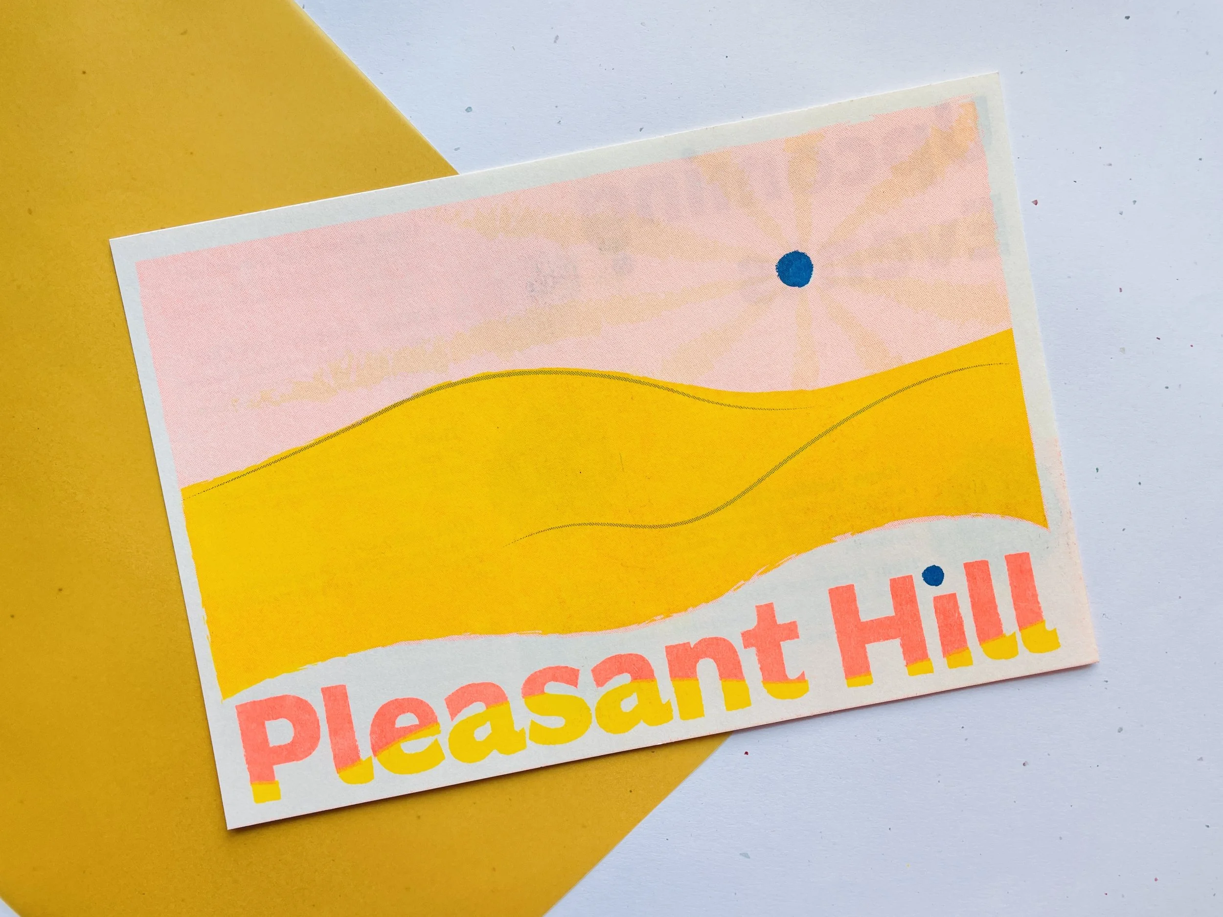
Moving into the development of the visual identity of the library I started first by developing the wordmark. When making the wordmark I wanted to make reference to the name of the branch by having a hill be present in some form. The first few versions felt clunky which is why I shifted to a version where the hill became a part of the text itself. The colors in the wordmark were chosen in an effort to connect the brand identity to the colors present in the physical space.

Early Version
Co-Branded Wordmark
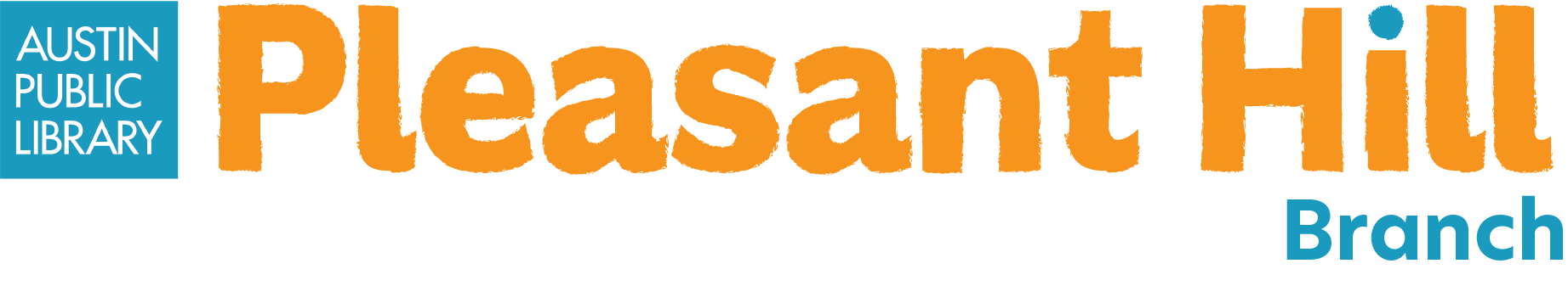
The co-branded wordmark is a simplified version of the main wordmark because it would often be used on a smaller scale. It also features the addition of the Austin public library logo and the term branch. Adding branch felt important because when cobranded it would be more about the austin public libraries as a whole and not the individual library.

Pictorial Logo
The pictorial logo features all of the elements seen in the word mark: color, the hill, and the dot. The pictorial logo is meant reinforce the visual elements present in the word mark. It also can be used in place of the word mark for social media, on T-shirts for library staff, or other deliverables.

Squiggle
The squiggles are an element that reoccurs within the other visual elements. Inspired by doodles/drawings it serves to bring a fun friendly energy to the visual identity as the library is very kid oriented.

Book Genre Icons
While visiting the branch I noticed that around the library they had posters on the bookshelves that aided visteres in finding specific book genres. However the posters had generic imagery that didn’t feel connected to the library so I chose to design a new set of icons that would be cohesive with the other visual identity elements.

Deliverables
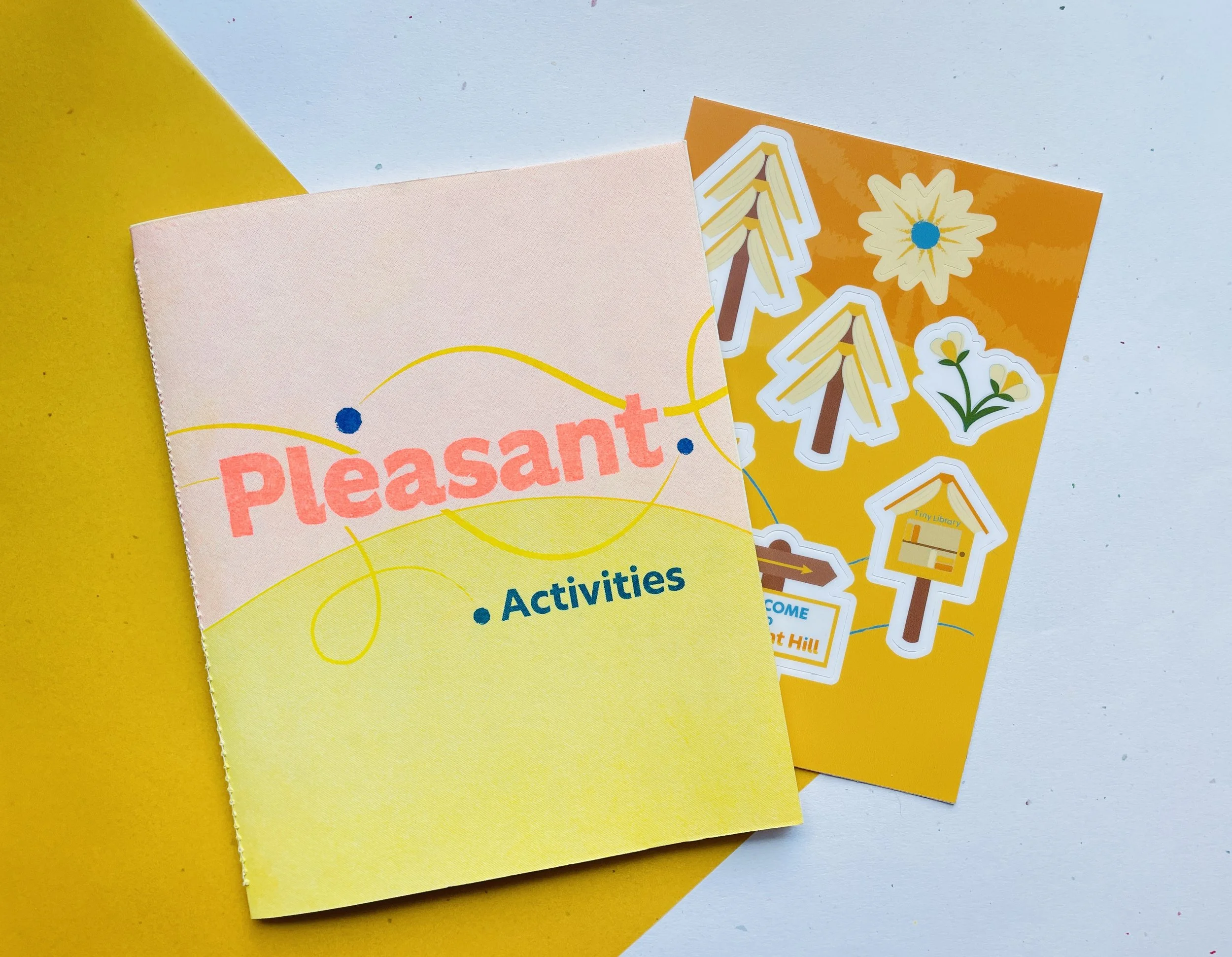
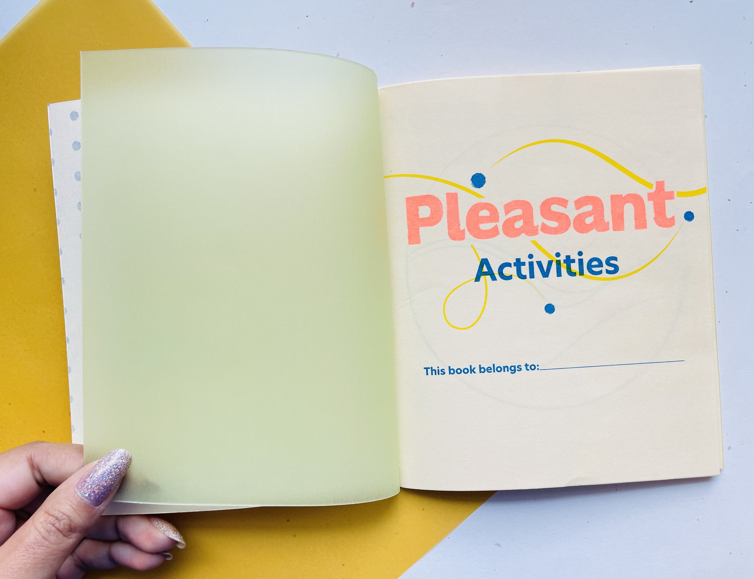
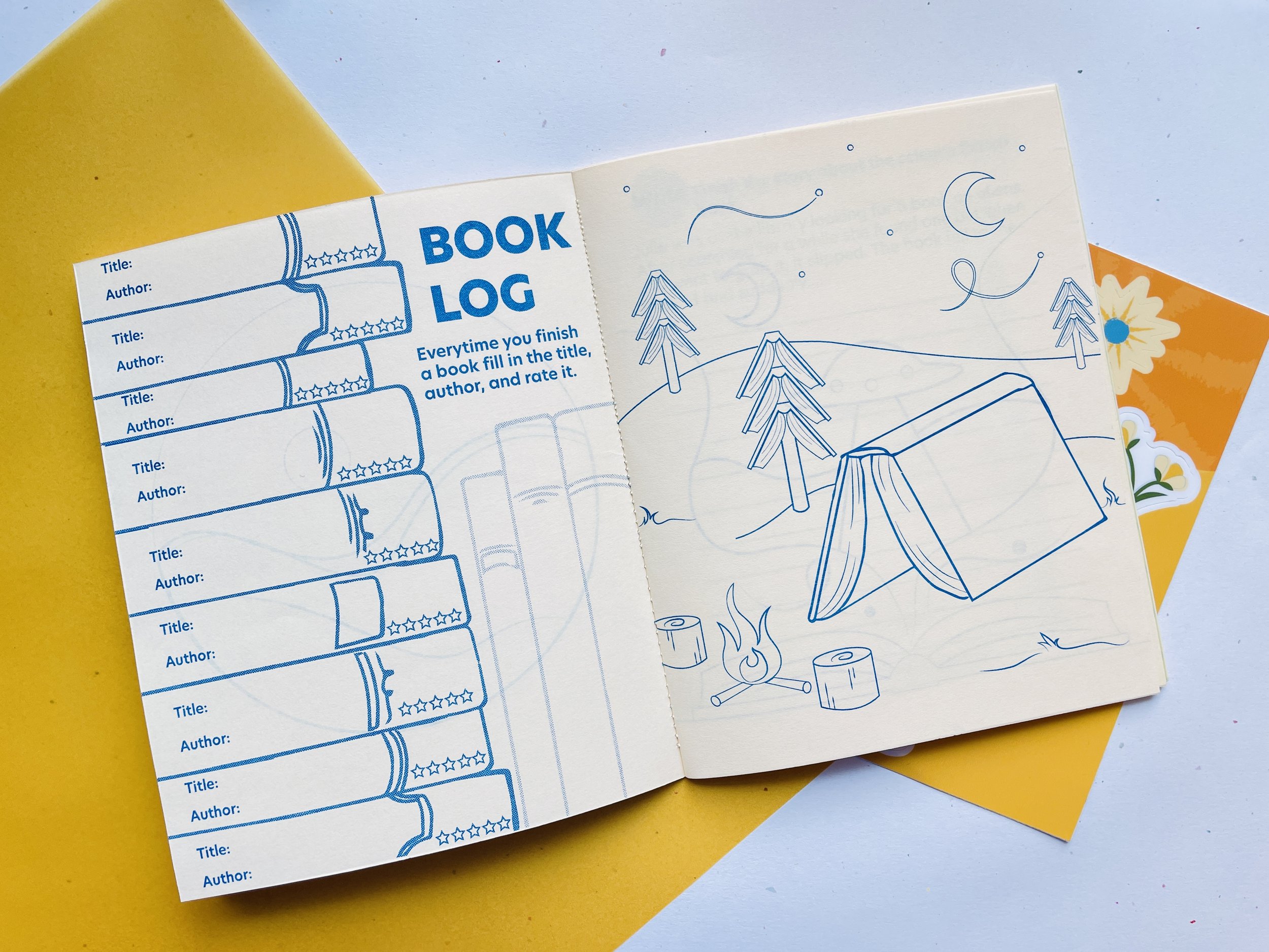
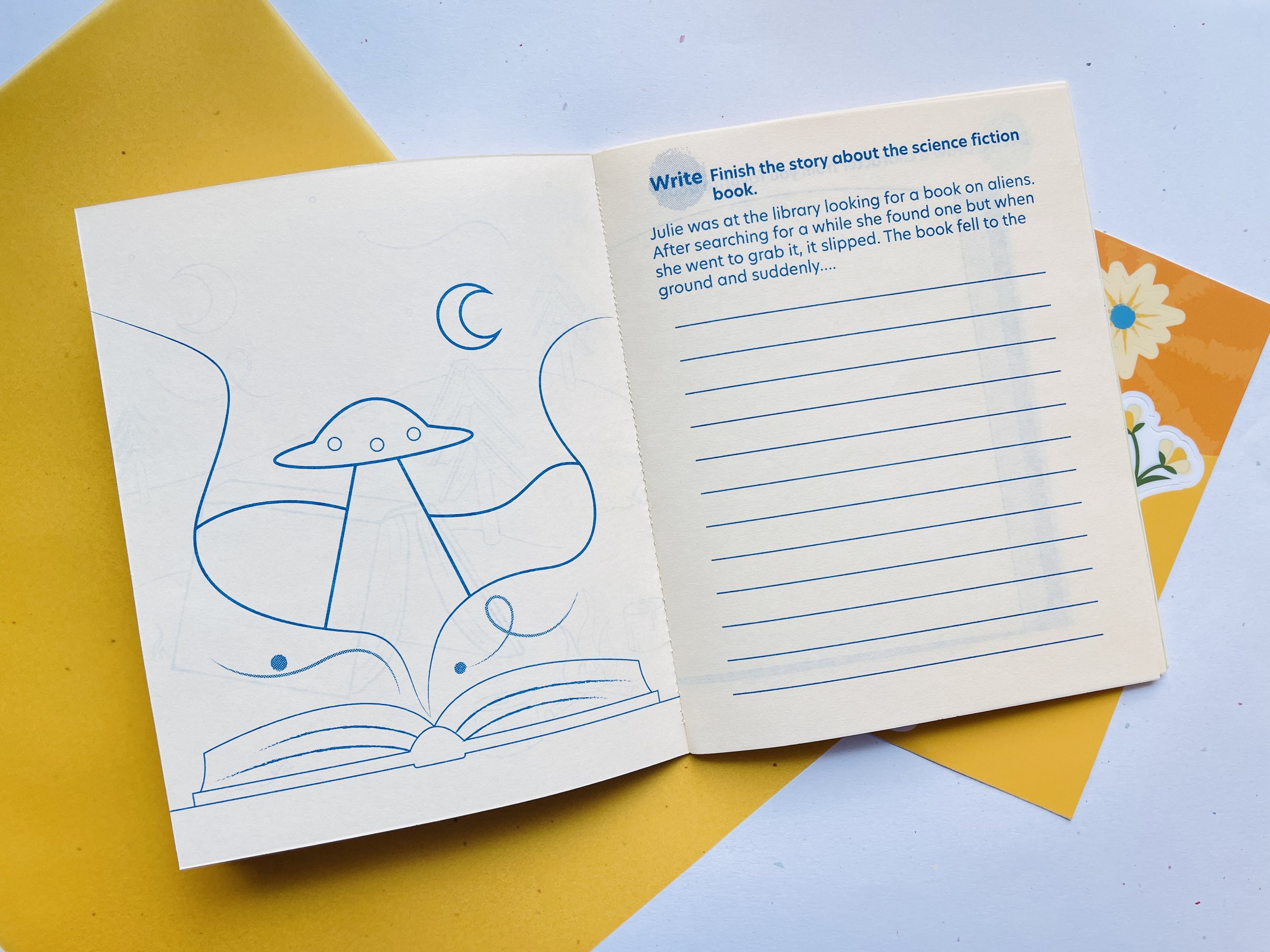
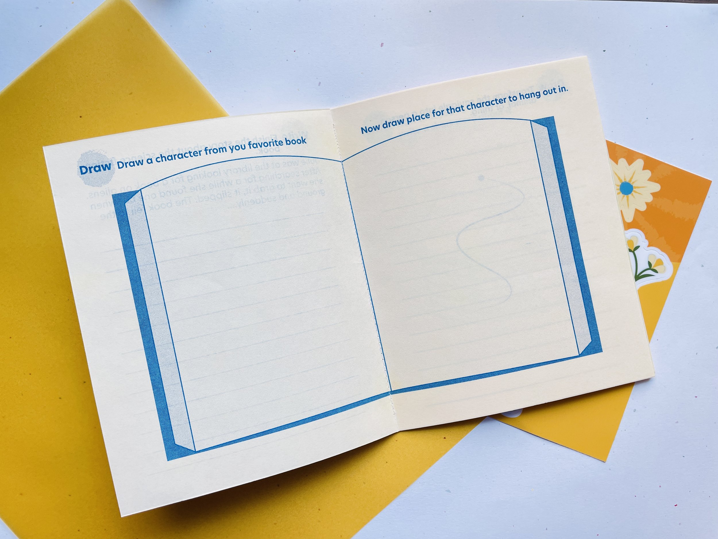
Pleasant Activities
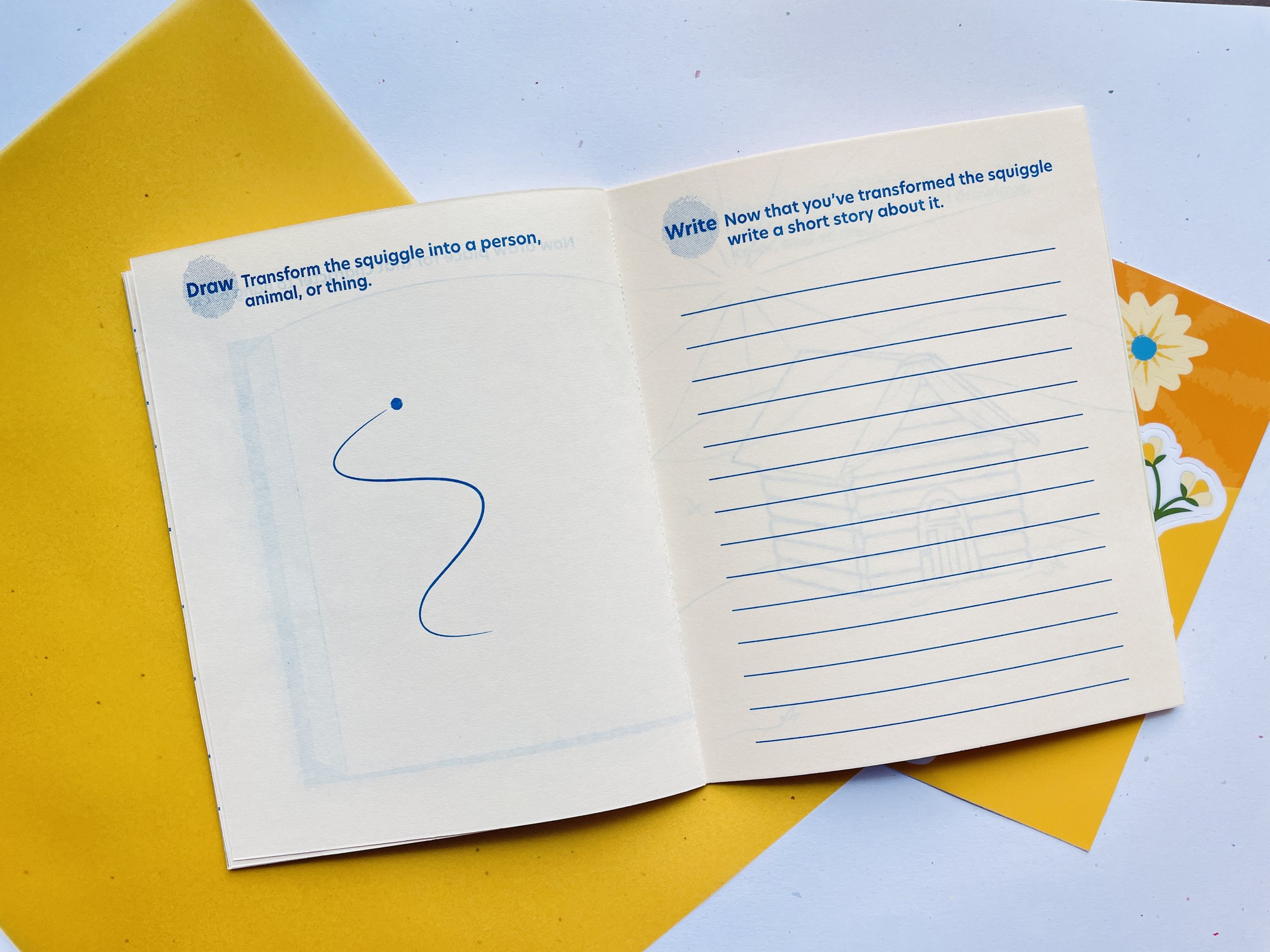
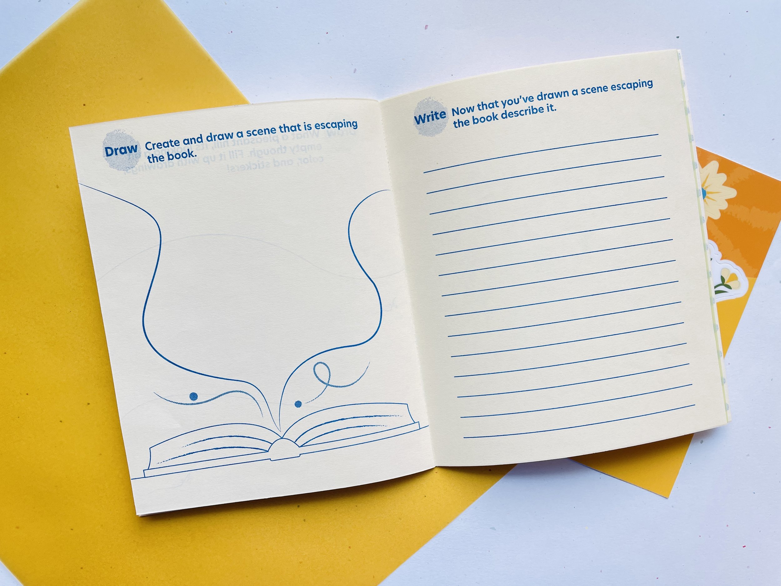
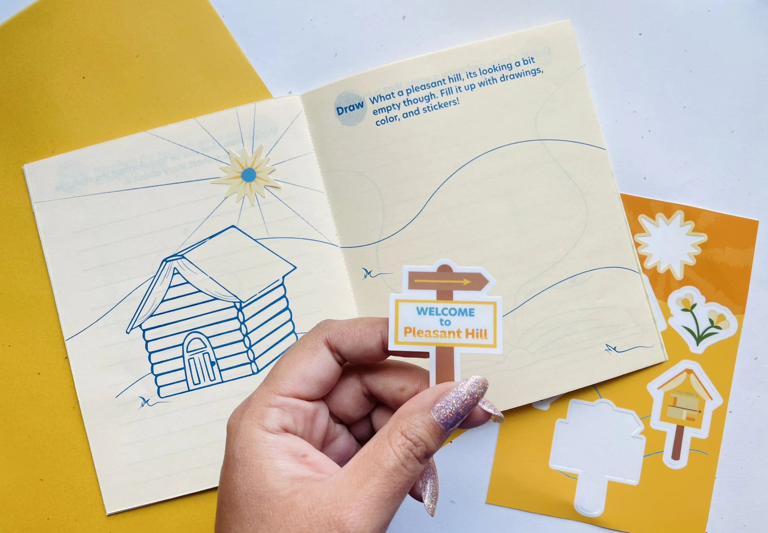
Is an activity book that features coloring, drawing, and writing exercises. The book itself is fully risograph printed and comes with a sticker sheet that can be used throughout the book.
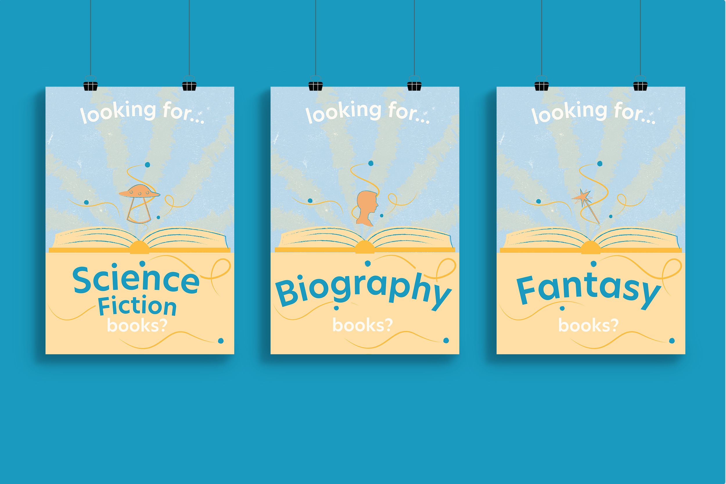
Book Genre Posters

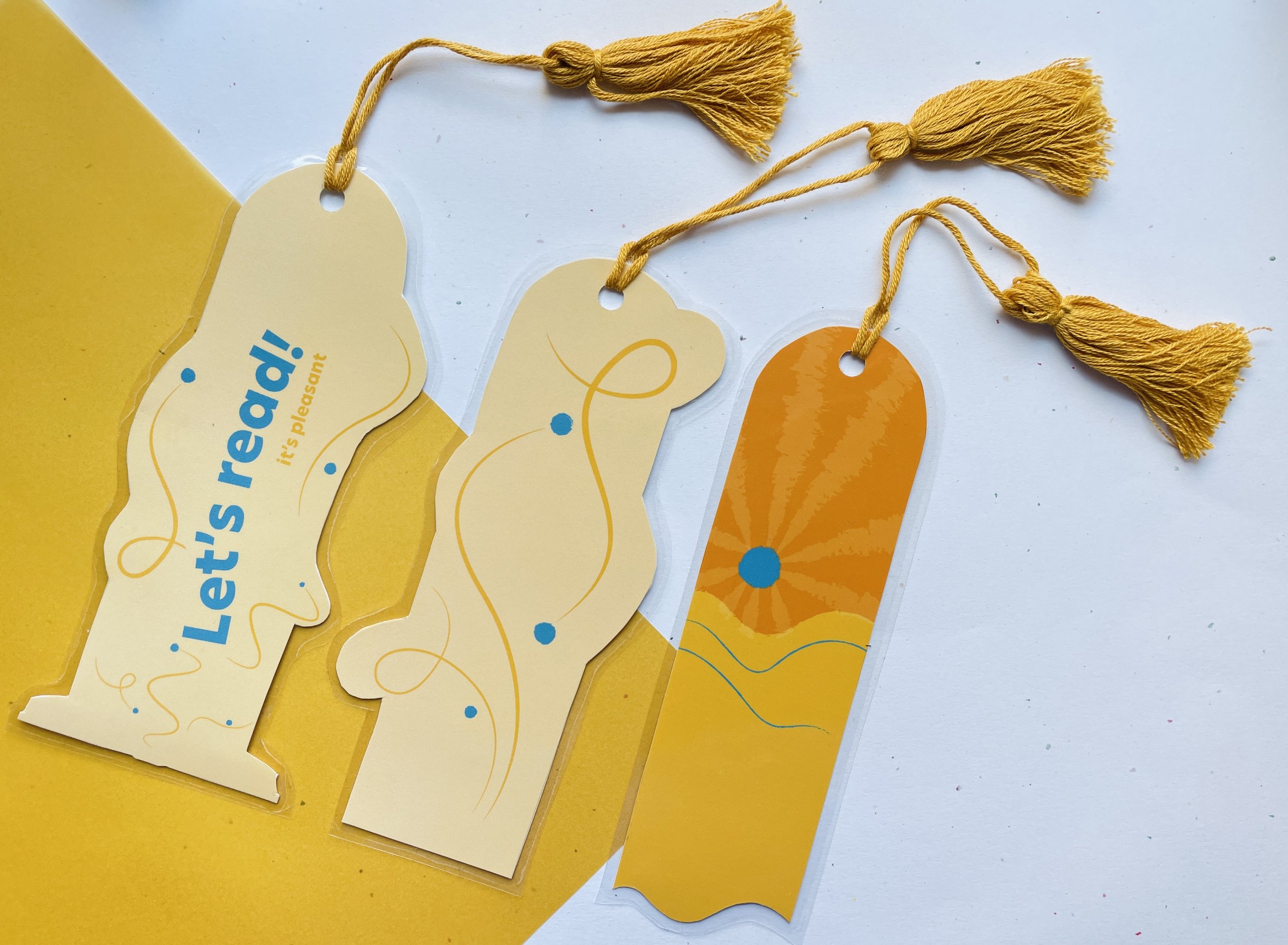
Bookmarks

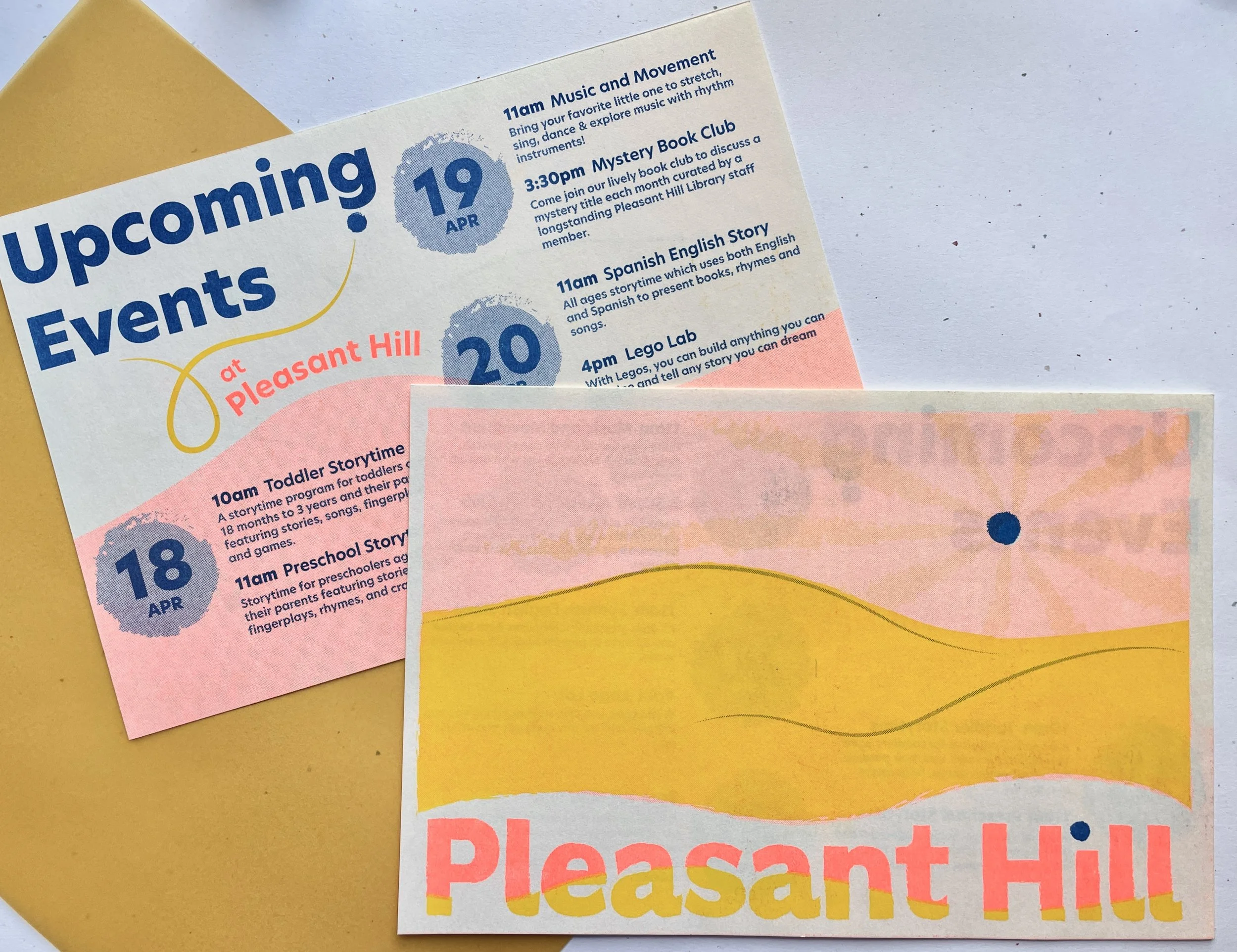
Event Reminder